I fucking love Julia Wertz.
She was an absolute fuck-up that eventually found her way. She’s so smart, so sarcastic, so cynical, so quippy and so filthy and I am absolutely here for it.
I’m still an absolute fuck-up and I can relate to all the above except for perhaps being smart, and I’m hardly the talent she is, but I can’t help but identify with her as I am totally screwed up and, like her, make no qualms about it while also realizing? That is not a great thing! (Like her, I’m trying to course-correct, but that will be a very long journey and it sucks but that’s life.)
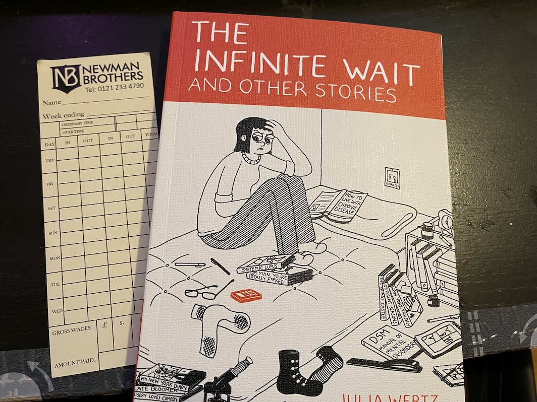
I previously wrote about her most recent work: IMPOSSIBLE PEOPLE: A COMPLETELY AVERAGE RECOVERY STORY. I am not sure how I missed out on THE INFINITE WAIT given I’d been reading her THE FART PARTY webcomic for years and years, but apparently? I did.
Better late than never!
THE INFINITE WAIT made me glow. I had a smile — a really fucking stupid grin — on my face the entire time I read it, which was within a day.
This work details a wide swath of her life, from when she was a child to graduating from college, and all of the jobs — mostly restaurant work and, as someone who has worked in the industry, wow that hit hard — and all of the messiness in-between. It is purely autobiographical but also? One hell of a lark, albeit at her own expense, but it is a very singular work about a very distinct person.
I’ve previously noted that artistically, her work is so effective and expressive, but what really shines here? Her relationships and brutal honesty, especially with her brother. There’s a camaraderie and earnestness there that I envy, and it’s so whip-smart and fun and nakedly true.
I loved every part of THE INFINITE WAIT, but especially reveled in the final part — the shortest facet of the work — which focuses on her fascination and absorption with her local library and reading which, again, I absolutely, 100% relate to. Hell, I even wrote a post about my own local library.
It’s not often I read a comic or graphic novel that resonates so much for me, but this? Yes. I even read it with a faux-library card bookmark without even realizing that the final chapter was all about her library! (That’s how much of a nerd I am.)
She is someone I wholeheartedly admire and aspire to be as a person.
So, please! Support her! You will not regret it! Her works are fun as fucking hell, while also so goddamn substantial! And she swears as much as I do, for better or for worse!
You can acquire a copy via Wertz’s website!

